GO AD-FREE. Get 2 Months Digital Subscription for ONLY £1! Use code 2FOR1
GET STARTEDMore on KentOnline
GO AD-FREE. Get 2 Months Digital Subscription for ONLY £1! Use code 2FOR1
GET STARTEDMore on KentOnline
The logo of a local authority in Kent has been ranked as one the worst in the country, according to a freelance graphic designer.
A list compiled by Robin Wilde features 399 council emblems – and while Canterbury City Council finished in the top 30, Medway Council was right near the bottom for its "outdated" and "leisure centre" design.
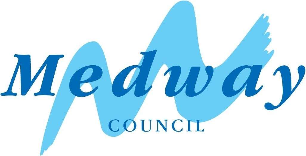
Medway Council
With 399 local authorities in the list, Medway Council ranked 378th for its poor choice of font and outdated design.
Mr Wilde said: "This reminds me very directly of the kind of logo you’d see on a leisure centre. Based on the river, there’s a nice concept here, let down by the outdated serif font."
Celia Glynn-Williams, Medway Council's head of marketing and communication, said: “Whilst we appreciate the tongue-in-cheek nature of the article, and that everyone has their own opinion about corporate logos, we are proud that our logo features the River Medway and our commitment to caring for the people of Medway.
"It would be difficult to design a logo that captures the 100-plus services that we provide to residents across Medway every single day and are quite sure that local people wouldn’t approve of time and money spent creating new logos in the current climate.”
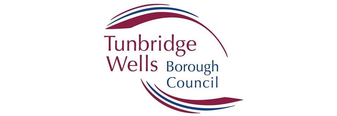
Tunbridge Wells Borough Council
Not doing too much better is Tunbridge Wells Borough council.
It ranked 371st with criticism of a "half-developed concept".
Mr Wilde said: "The device reminds me of the sort of low-selling young adult fiction I used to take out of the school library in about 2006.
"An attempt has been made here, but it feels like a half-developed concept that gave up on itself halfway through the execution."
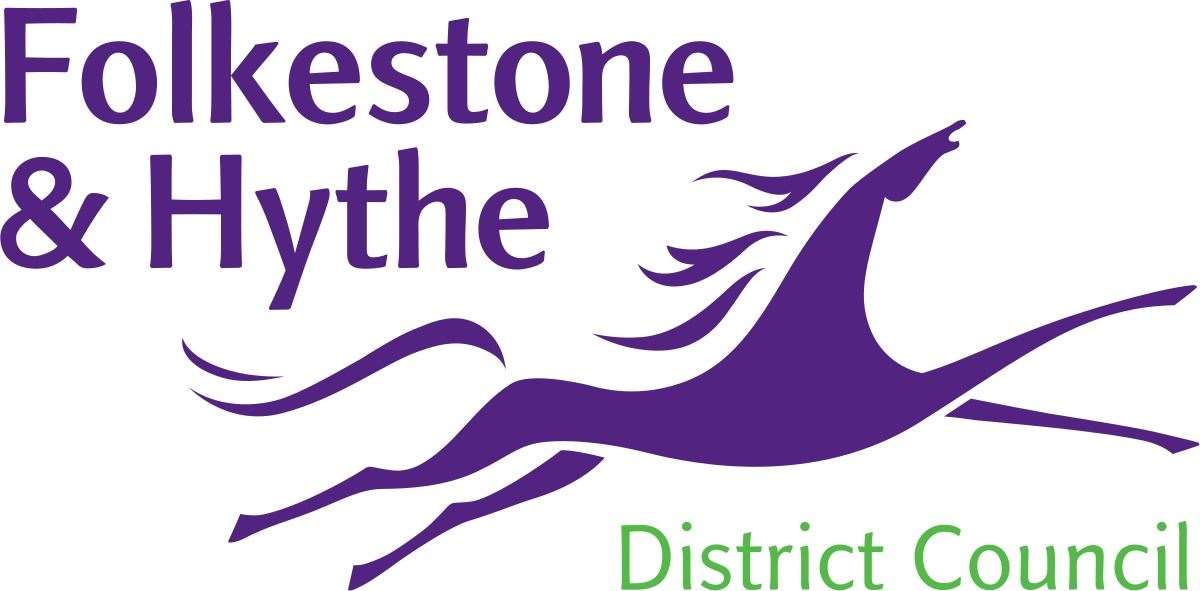
Folkestone and Hythe District Council
The distinct purple and green logo of Folkestone and Hythe District Council was also left struggling at 370th.
According to Mr Wilde, the horse appears to be in pain due to the poor drawing and shape of the design.
He said: "Unfortunately, given it’s copied directly from the famous white horse, this horse does look more like it’s in pain than galloping majestically.
"It might be the lack of eyes."
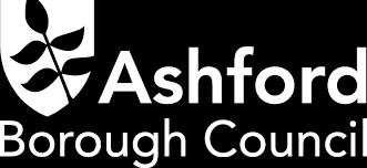
Ashford Borough Council
Only slightly higher is Ashford Borough Council for its monochrome logo.
The council was ranked 318th but Mr Wilde had little to say about the emblem.
He simply said: "Ash-bored more like."
Perhaps a pop of colour could boost Ashford Borough Council a bit higher?
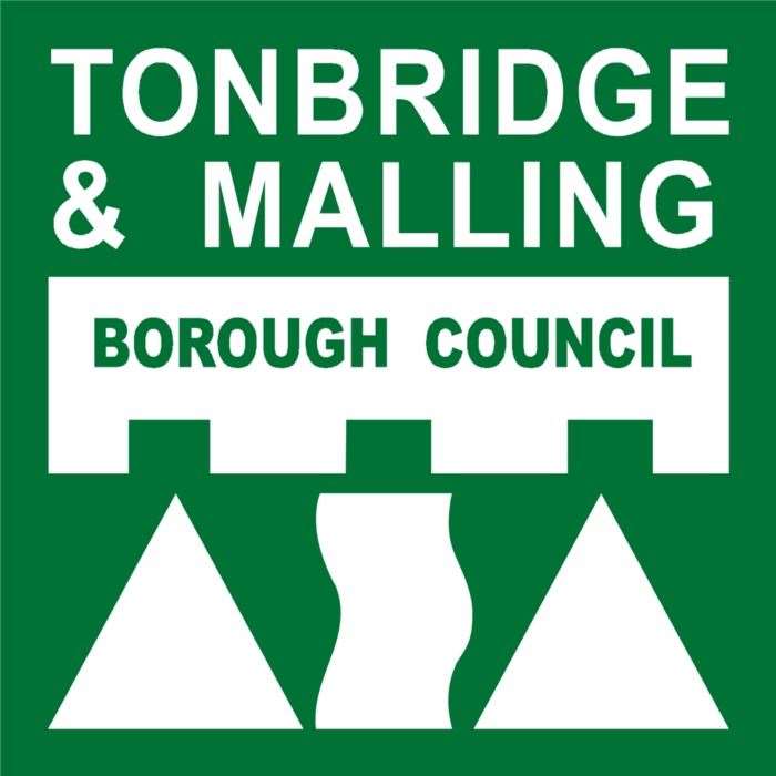
Tonbridge and Malling Borough Council
In 284th place is Tonbridge and Malling Borough Council for the bright green square emblem.
Mr Wilde said: "This very definitely wasn’t created by a professional designer which tends to allow me to grade more on a curve, and it reminds me most of the logo for the old 3DO games console from the 1990s.
"I think there’s a charming level of effort to it, but it doesn’t really communicate much except for 'we have a castle or possibly some Lego bricks'."
"Also, the curves on the central river device are slightly asymmetrical and it’s really bothering me."
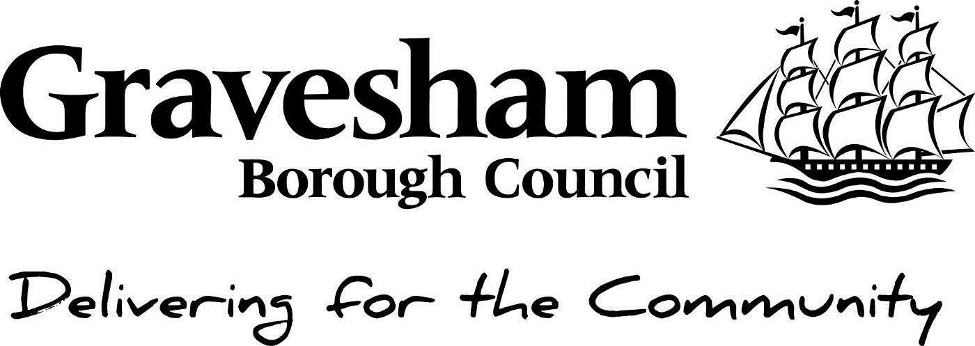
Gravesham Borough Council
Just scraping into the top 250 is Gravesham Borough Council for its boat logo.
In 249th place, some would argue this is a respectable position for the "clip-art" design.
Mr Wilde said: "Drink every time you see a boat, a deer, or a fox. On second thoughts, please don’t, I need you alive.
"Another nice font choice let down by the shoehorning of handwriting font and the clip-art boat."
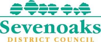
Sevenoaks District Council
Just four places ahead of Gravesham is Sevenoaks District Council.
The logo follows the name directly – seven oak trees with a simply green and yellow typeface.
However, the simplicity seems to be too predictable for the graphic designer.
He said: "There certainly are seven of the buggers."
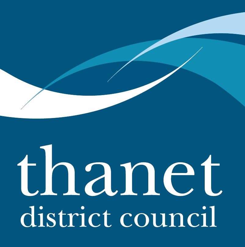
Thanet District Council
In 216th place is Thanet District Council.
The squiggles were praised by Mr Wilde, as well as the lack of capitalisation in the logo – a bold choice which has paid off.
He said: "They’re squiggles, but done with a certain artistry.
"I have to admire the boldness of doing 'lefties on twitter' style lack of capitalisation in a local government logo, set in serif font."
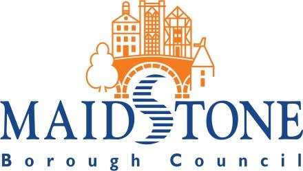
Maidstone Borough Council
Maidstone Borough Council is in a respectable 139th place for the orange and blue emblem.
The clever use of the river to form the 's' in Maidstone has been criticised – maybe they were trying to be too clever?
Mr Wilde said: "This is almost really good, if they hadn’t had to overly warp the river to make it into a recognisable 's' shape.
"The illustrations are good though."
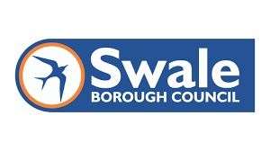
Swale Borough Council
The "budget airline" design meant that Swale Borough Council finished in 132nd place.
However, the graphic designer was impressed by the neat design and use of orange.
Mr Wilde said: "This is the kind of logo a TV show might create for a budget airline so it can avoid infringing copyright, but each element is nicely deployed.
"Orange is underused as a highlight colour in these council logos despite its high visual impact and lack of partisan connotations."
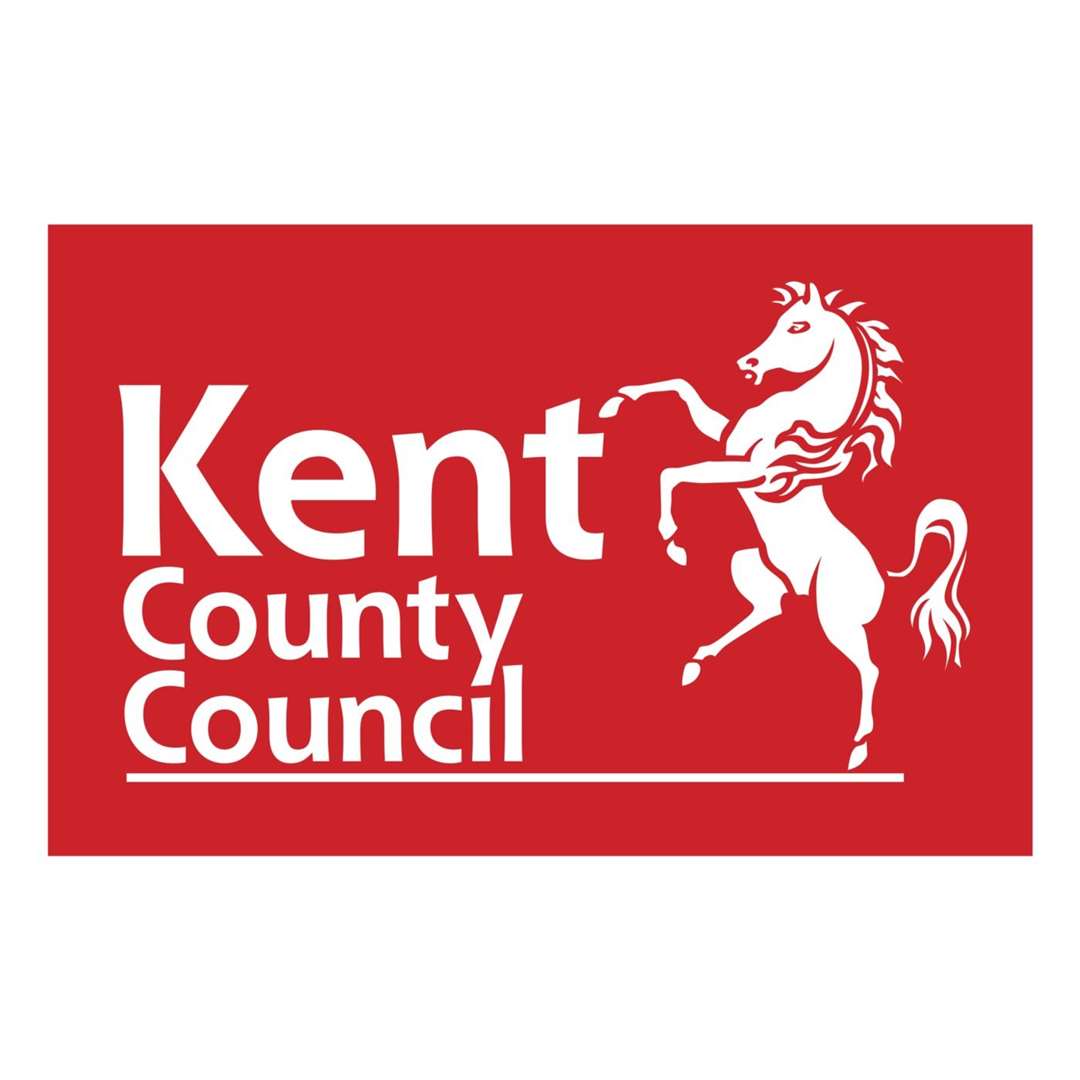
Kent County Council
It's 123rd place for the iconic Kent County Council logo.
Mr Wilde added: "The Kent Horse must be a nightmare for designers to work with – so iconic it can’t be left out or adulterated, but an absurd shape that won’t work with any hierarchy.
"Still, this is an improvement on the old logo, which used Neo Sans, a font I associate exclusively with the Brown and Miliband eras of the Labour Party.
"The slightly organic curves of the new font are quite pleasant, and the successful working together of the 'y' in County and the 'i' in Council makes me doff my internet cap."
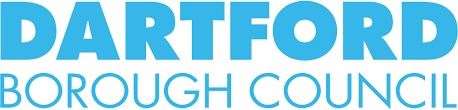
Dartford Borough Council
Dartford Borough Council's design is in 114th place and the logo makes it into the top three for Kent.
A very simplistic design and the clean looking logo is applauded by the graphic designer.
He said: "I will applaud anyone who joins me on board the Futura train, a modernist express locomotive heading towards a bright shining art deco future.
"Probably could use some sort of visual, but that’s a relative nit pick."
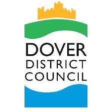
Dover District Council
The runner up for Kent and 74th overall is Dover District Council
Using the iconic landmark of Dover Castle with the sea was an obvious choice with modern execution, says Mr Wilde.
He added: "Splitting the castle from the sea using negative space white cliffs is very nice as an idea, but it takes a second."
However, he criticised the font as it doesn’t quite meet the "required boldness".
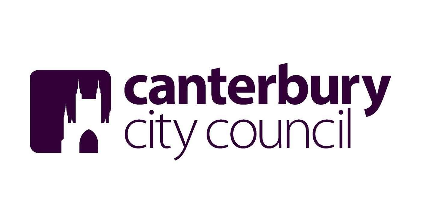
Canterbury City Council
Finally, the best council logo in the entire county, according to Mr Wilde, is Canterbury City Council – finishing in 27th place overall.
Mr Wilde praised the logo for the designer avoiding the temptation to overcomplicate and the use of regal purple to show the city's age and heritage.
A Canterbury City Council spokesman said: "Because people care so much about their council, the area it serves and the work it does, logos and branding can split people down the middle – a bit like Marmite, it becomes a love/hate thing. Everyone has a view because people care.
"Our current branding was designed in house with the fact it needed to work online and on social media as well as the traditional places you see council logos.
"While we're pleased someone out there loves what we did, we know people also loved our former branding with the Cathedral representing the city, a tree representing the villages and the sea representing the coast.
"The closest we normally get to being regal is through the Lord Mayor and the Sheriff, so it is nice for the rest of us to be in the same category as them!"